
 Over the past several years, standard web design has drastically evolved, yet many sites are still living in the stone ages. Desktops and laptops used to be the only devices visitors viewed your site on. Now, mobile devices are beginning to become the norm. According to the sixth annual Localeze/15miles/comScore Local Search Study, by December 2012, mobile search in the US was up by 26%, equaling 113.1 million searchers. That’s just mobile phones. Tablet use was up by 19%. These increases can’t be ignored. So what can you do to make sure you cater to mobile and tablet users?
When smartphones first hit the market, “mobile sites” was the go to for cutting edge sites. The end result was several different versions of the same site that didn’t really cater to the audience. Sometimes one version was updated while another wasn’t. As soon as a new device came out, the mobile version of your site didn’t quite work right. The solution isn’t complicated. Let me introduce you to responsive web design.
Go Responsive To Meet Every Need
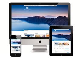
What if you could create a single site that fits every device, no matter how big or small? Wouldn’t that make your life so much easier? One of the newest and best technologies around is responsive web design. It automatically optimizes itself to match the device your site is being viewed on. You create a single site and visitors will be amazed at how well you cater to all their various devices. The great thing is it’s actually a low cost solution.
Why Two Versions of Your Website Aren’t Enough
Some site owners try to create a desktop/laptop version and a mobile/tablet version. They believe two sites won’t be that hard to maintain. Anytime you double the workload, you double the possibility for mistakes. You double your analytic work and may not realize what elements are truly working for your site and which aren’t until visitors have moved on to your competitor.
You should never make things harder on yourself. When you can’t predict where your visitors will come from, choose the solution that covers all your bases. One site, one set of content, one stop analytics, one site to update – you get the idea.
How Responsive Web Designs Work
When you create your website using mobile/responsive web design, your site adjusts to include the most important elements at the forefront. Text and images adjust to best fit a visitor’s screen without the visitor having to scroll endlessly or zoom in just to see a few sentences. During the setup process, you choose which sections of your site are essential. The responsive design then creates mobile and tablet versions automatically.
The Future of Responsive Design
The way users surf the Internet has changed so quickly that web design is still struggling to catch up. However, responsive design isn’t something to shrug off. The answer is finally here. While it’s not perfect yet, it is the new web design choice for anyone who truly wants to make their site available to anyone anywhere. Check your competitors. Some are likely already utilizing the new technology. Shouldn’t you be too?
What do you have to lose? You save time and money. You increase your audience. Your site is prepared for whatever new devices launch next. It’s a win win that you can’t afford not to try.